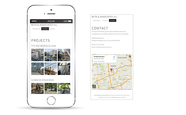
The Beta & Associates website automatically converts itself to mobile when visited by a smartphone or tablet. This is called responsive design and helps to format the website regardless of the device size viewing the website, as well as keep changes simple. Because changes only need to be made once, affecting both the desktop and mobile versions of the website.
// Web Designer in Kitchener-Waterloo
