Amherst Mouldings 2016 Re-design
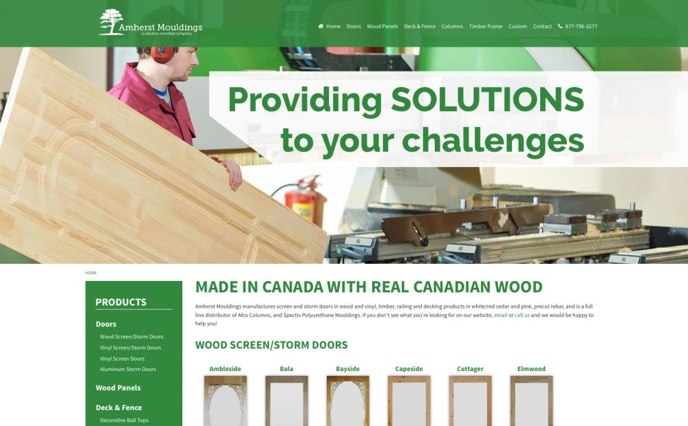
Amherst Mouldings produces Canadian-made storm and screen doors, in wood. Vinyl and metal are also available. Other products include fence and deck base and caps, and panels made from various types of wood. A mobile version automatically recognizes when a smartphone is viewing the site and updates its design accordingly to allow easy browsing on […]
Making Better Coffee
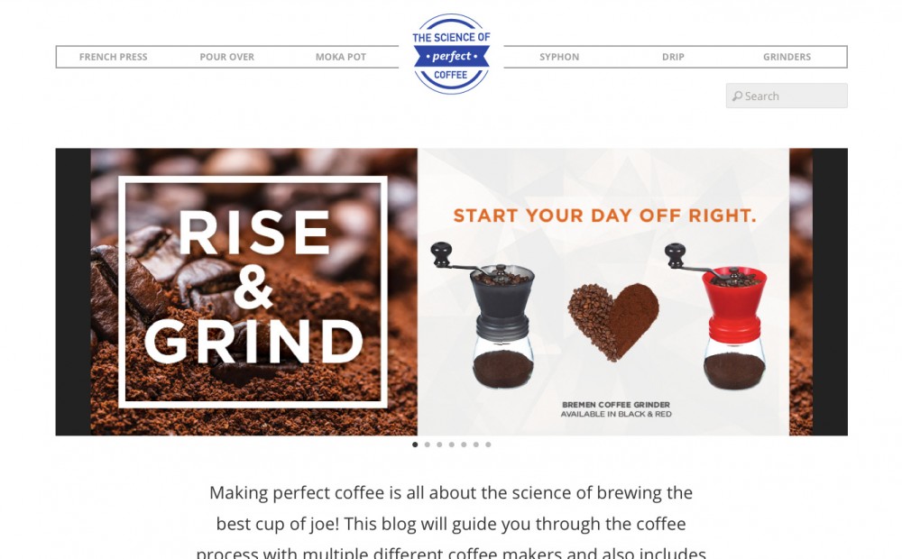
Making Better Coffee offers great recipes, tips, products and more about our favorite morning brew.
ACME Telephone – Mobile Website
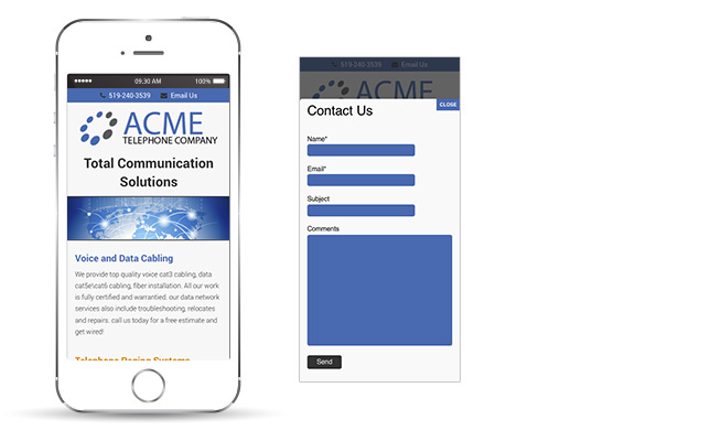
A responsive mobile version of the ACME Telephone website created to make the website automatically format itself based on the size of screen viewing the website.
Lake Front Cottages – 2014 Mobile Website
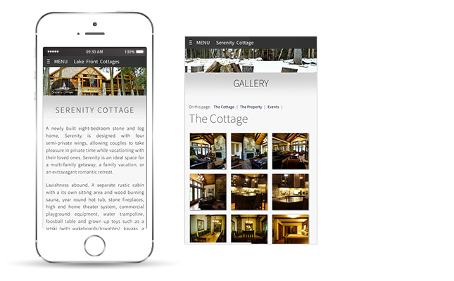
This responsive mobile version works on multiple devices and screen sizes. The website is beautiful no matter on smartphone or tablet.
Beta & Associates Mobile Website
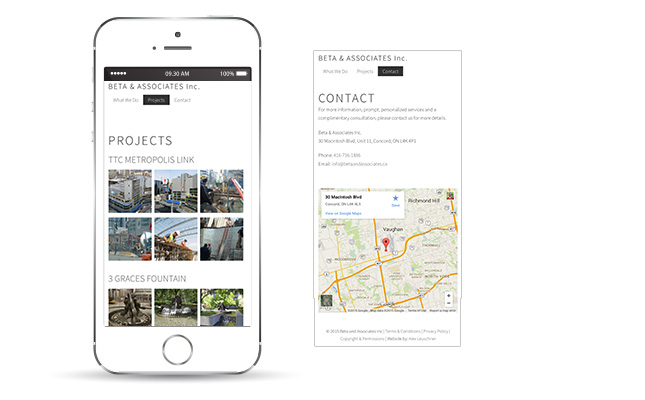
The Beta & Associates website automatically converts itself to mobile when visited by a smartphone or tablet. This is called responsive design and helps to format the website regardless of the device size viewing the website, as well as keep changes simple. Because changes only need to be made once, affecting both the desktop and […]
Ed Korschewitz Campaign Mobile Website
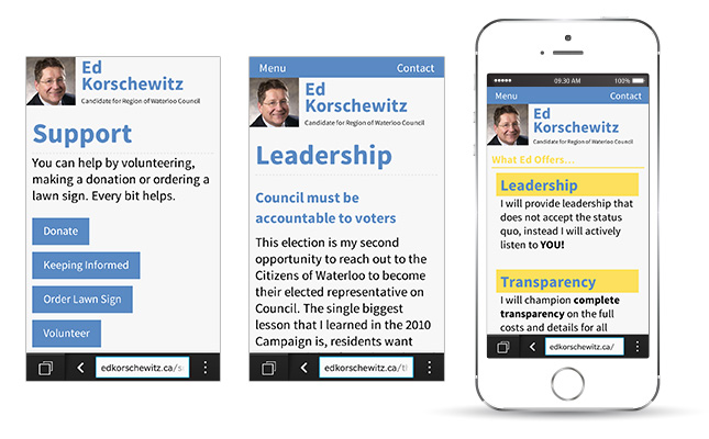
The mobile website created for Ed Korschewitz’ campaign.
Gabriele Korschewitz Campaign – Mobile Website
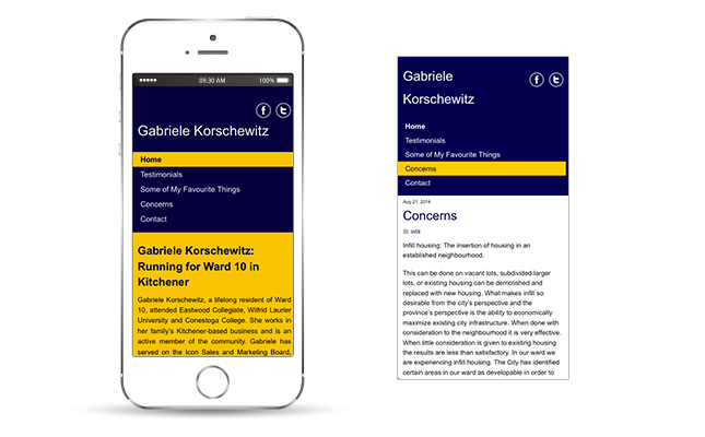
The mobile website for Gabriele Korschewitz’ campaign.
The RapidClip by BizoN America – Mobile Website
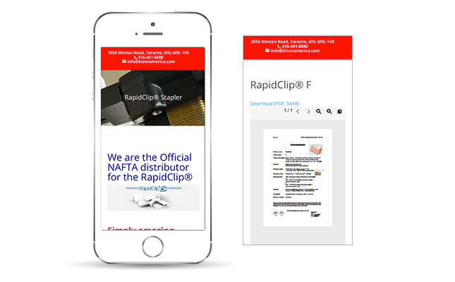
The mobile site for BizoN America.
Vote Jay Aissa – Mobile Campaign Website
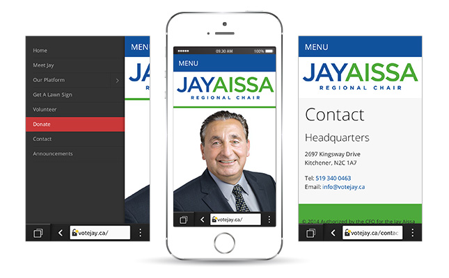
The mobile friendly version created for the Jay Aissa Campaign. It is responsive and so detects what screen size is viewing the website and adjusts itself accordingly.
Frankies Pizza – Mobile Website
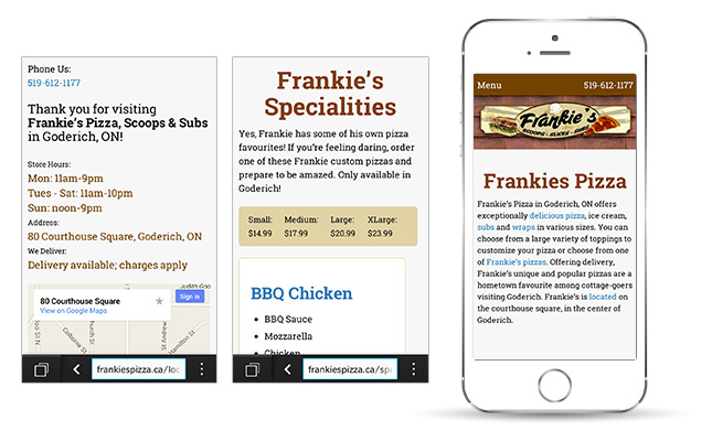
Frankies Pizza mobile website